
Color Trends Suggest Disappointment but Also Determination
Clariant’s ColorForward team predicts 2018 colors to be organic tinged with grey, reflecting a “dark mood” among consumers.


Clariant’s ColorForward team predicts 2018 colors to be organic tinged with grey, reflecting a “dark mood” among consumers.
Colorants are a topic on which we report on regularly—ranging from new highly-loaded masterbatches, liquid colorants, and special effects, to the important area of processing-related issues. Take a look for example at our September 2016, special supplement, “Color Done Right”. From time-to-time, we have also blogged about color trends and the ‘psychology of color’.


Typically, we’ll all be alerted to the coming year’s color trends as determined by some key suppliers of colorants & additives as well as materials, and sometimes targeted to specific end-markets—from food packaging to automotive. It is far rarer to see longer-term outlooks. One example, on which I blogged about this year, came from BASF’s Color Excellence Group and how they strived to come up with their ‘scientific predictions’ on 2020 automotive colors by global region.
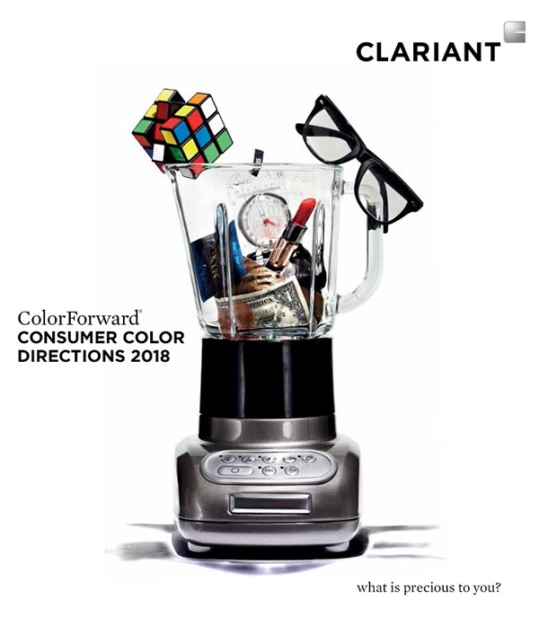
The international ColorForward team of Clariant (U.S. headquarters in Charlotte, N.C.) just announced the release of ColorForward 2018, its 12th edition of the annual color forecasting guide for the plastics industry, by diving into the state of consumer attitudes and likely color preferences for the coming years. The team came up with four color predictions based on four global social trends, all of which reflect an over-arching feeling of sadness, fear and distrust of the current “conventional world”. At the same time, these trends suggest determination.
The ColorForward advantage comes from its long-term global view of social trends whereas other forecasts are more focused on reacting to short-term trends, according to Judith van Vliet, Clariant ColorWorks designer and leader of this team. “We will present the 2018 forecast at Heimtextil in Frankfurt in January and at Stockholm Design Week in February, and we have been invited to speak at the prestigious Fuse London design event in December… It is very unusual for a company like Clariant to be consulted on trends by the design community and I think it is a very real reflection of the respect they have for our work,” she says.
Meanwhile, ColorForward 2018 has been totally repackaged. The presentation materials are simpler and cleaner. The forecast developers composed a single image for each of the four trend themes. Then, discrete facets of each image are used to represent the different elements of each trend. The trend colors are offered in a printed booklet and with molded plastic plaques that allow participants not only to see the colors but also to touch them, feel them and hold them in different lighting or against different backgrounds. Here, then, are the Clariant ColorForward 2018 colors and trends, which are best described as organic and tinged with grey:
• Newmorrow color palette includes a brownish green called Primordial Soup, which has been referred by some as the ‘ugliest color in the world,” but also remind us of the verdant, rich biological goop that spawned life as we know it. The team sees this trend theme as reflecting a ying-yang mood among consumers. One one hand, they believe the “system” is rotten; on the other, there is also a conviction that change is still possible—not by government but from grass-root efforts of individuals and small groups.
• LongitudeLatitudeAttitude colorants are Bohemian—ranging from a purplish fuchsia, Nomadness, a warm, almost-orange yellow named Kaleido tribe, and a grey-blue called Cirrus aviaticus after the contrails of jet planes against the otherwise cloudless sky. So, dissatisfaction with convention is also behind this trend theme—which acknowledges that a growing number of human beings are choosing to have no fixed address—the “new nomads”. These New World citizens, says the team, cherish the flexibility of a lifestyle that embraces their passion for life on the move and the immerses them in a fusion of ethnicities and interests.
• Through the mirror pearl orange color palette is inspired by a yoga practice based on the Sanskrit phrase ‘trataka’—to gaze steadily at a fixed spot in order to focus the mind inward, blanking out visual perception and withdrawing from the external world. This trend theme attempts to capture a sense of ennui—of being adrift in a modern world while, at the same time, knowing that a spiritual reawakening is possible.
• Nerdylicious colors, while soft and subdued like most in the other trend groups, are nevertheless the brightest and most optimistic of any in the 2018 palette. Lightning Boot, for instance, is a transparent almost-orange yellow that is reminiscent of LED lights on a control panel, while Alberting out! is a slightly dirty optical white—a tribute to the ultimate nerd, Albert Einstein. It reminds one of lab coats gone dingy after back-to-back 18-hr work days. The Nerdylicious theme comes from the validation of a group of people long stereotyped as a bunch of quirky, overly intellectual misfits—the “nerds”. The trend theme sees these brainiacs finding acceptance as innovators in a complex world, with continuous curiosity and a passion for exploring new ideas and complex puzzles.


Related Content

Coke Makes Bottle Changes to Boost Recycling
Sprite bottles will be clear, while Dasani bottles will be made with recycled plastic.
Read More
Sorting Mixed Plastics by Color and Type
Steinert will demonstrate plastic sorting technology at K 2022.
Read More
Get Color Changes Right In Extrusion Blow Molding
Follow these best practices to minimize loss of time, material and labor during color changes in molding containers from bottles to jerrycans. The authors explore what this means for each step of the process, from raw-material infeed to handling and reprocessing tails and trim.
Read More
Color-Measurement for Extrusion, Molding
System helps processors control the cost of quality due to color variations, using real-time color data for QC analytics and color optimization.
Read MoreRead Next

Understanding Melting in Single-Screw Extruders
You can better visualize the melting process by “flipping” the observation point so that the barrel appears to be turning clockwise around a stationary screw.
Read More
Lead the Conversation, Change the Conversation
Coverage of single-use plastics can be both misleading and demoralizing. Here are 10 tips for changing the perception of the plastics industry at your company and in your community.
Read More
How Polymer Melts in Single-Screw Extruders
Understanding how polymer melts in a single-screw extruder could help you optimize your screw design to eliminate defect-causing solid polymer fragments.
Read More